Why We Rejected 50 Concepts for One Logo (Design Truths)
Why We Rejected 50 Concepts for This One Logo (The Hard Truth of Design)
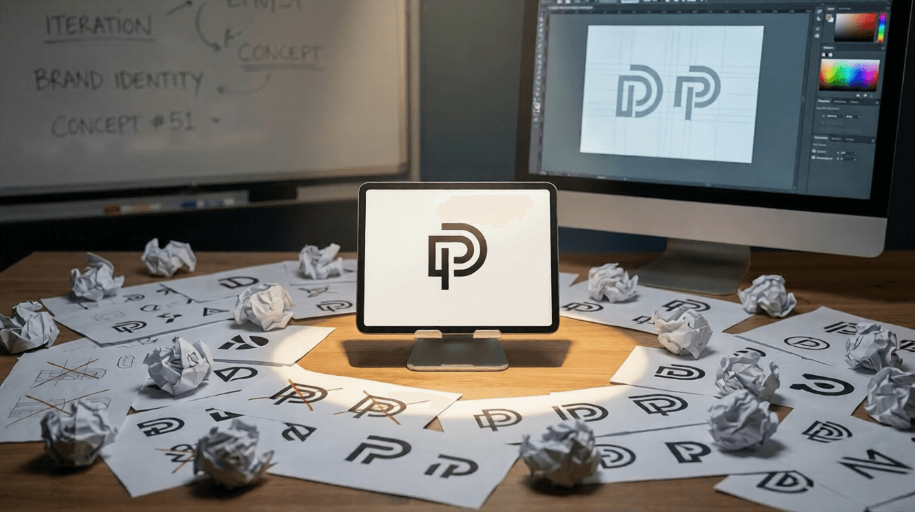
Many people assume that a brilliant logo is born in a single stroke of genius on a napkin. In reality, the professional logo design process is rigorous, exhaustive, and sometimes brutal. When we recently set out to create a new brand identity for a client, we generated and subsequently killed 50 distinct concepts before landing on the final winner.
This is the hard truth of graphic design: creating something incredibly simple requires navigating through a maze of complexity. In this post, we will break down why rejecting dozens of good ideas is the only way to find the great one.
What is the Logo Design Process?
The logo design process is an iterative journey involving research, brainstorming, sketching, and refining. It frequently requires rejecting dozens of initial concepts to uncover the single, most effective visual representation of a brand's core identity and values.
The Illusion of the "First Try" Masterpiece
Clients often see the final polished logo and assume it was the first idea the designer had. This misconception stems from the fact that good design feels inevitable. When a logo perfectly encapsulates a brand, it looks as though it has always existed.
However, achieving that level of simplicity requires a comprehensive logo design process. A successful designer must explore every possible avenue, visual metaphor, and typographic combination to ensure no stone is left unturned. If you settle for the first decent idea, you run the risk of creating a generic mark that fails to differentiate the brand in a crowded market.
Why We Explored (and Rejected) 50 Logo Design Concepts
To understand why we threw 50 designs in the trash, it helps to look at the stages of iteration. The journey from blank page to final file is rarely a straight line.
Concept Phase 1: The Broad Strokes (Concepts 1-15)
In the initial phase, we focus on quantity over quality. We explore a wide array of visual directions, mapping out different metaphors related to the client's industry. These concepts were rejected because they were either too literal, too cliché, or fundamentally missed the target audience's emotional triggers.
Concept Phase 2: Narrowing the Focus (Concepts 16-35)
After reviewing the initial batch, we identified a few promising directions. We generated variations based on these themes, tweaking shapes, proportions, and negative space. These 20 concepts were eventually discarded because, while structurally sound, they lacked the distinct "own-able" quality required for a memorable brand identity.
Concept Phase 3: The Micro-Refinements (Concepts 36-50)
The final phase of rejection is often the most difficult. We had three incredibly strong concepts, and we pushed each one to its limit by testing different typography pairings and color palettes. Ultimately, 14 of these final iterations were rejected because they didn't scale perfectly to smaller sizes or felt slightly unbalanced when placed next to the company name.
The "Hard Truths" of Graphic Design
Behind every successful branding project are several uncomfortable realities that designers and clients must accept. Embracing these truths makes the final product vastly superior.
- Your favorite idea might be the wrong idea. Sometimes a concept is beautiful but fails to communicate the brand's core message.
- Simplicity is incredibly difficult. Stripping a design down to its essential elements takes more time than adding complex details.
- Rejection is a feature, not a bug. Throwing away good work is a necessary step in isolating the great work.
Expectation vs. Reality in Design
| Expectation | Reality |
|---|---|
| Inspiration strikes instantly. | Ideas are generated through disciplined research. |
| The designer will present 3 perfect options. | The designer filters through 50 concepts to show the best 3. |
| The process takes a few hours. | The process takes weeks of iteration and testing. |
Frequently Asked Questions
How many logo concepts should a designer provide?
While a designer might create dozens of sketches behind the scenes, they typically only present 2 to 4 highly refined concepts to the client. Presenting too many options can cause decision paralysis and dilute the impact of the strongest ideas.
Why does a professional logo cost so much?
You are not just paying for the final graphic; you are paying for the exhaustive logo design process. The cost reflects the research, strategy, competitive analysis, and the dozens of discarded iterations required to ensure the final logo performs perfectly.
What makes a logo concept successful?
A successful logo is memorable, scalable, relevant to the industry, and simple enough to be recognized at a glance. It must also accurately reflect the brand's personality and work effectively across various mediums, from billboards to fav icons.
How long does the logo design process take?
A professional branding project typically takes anywhere from two to six weeks. This timeline allows for adequate market research, internal brainstorming, multiple rounds of sketching, client presentations, and necessary revisions.
Conclusion
The path to a timeless brand identity is paved with discarded sketches and rejected files. Generating and rejecting 50 concepts wasn't a sign of inefficiency; it was the required diligence of a thorough logo design process. By embracing the hard truths of design and leaning into rigorous iteration, designers can ensure that the final logo they deliver is not just a pretty picture, but a powerful business asset.
Work with Art Drawn Studio